Collaboration is beautiful
Where design meets bioinformatics, new scientific perspectives abound.
“I thought they would just make pretty pictures.”
When EMBL-EBI bioinformatics researchers Nick Goldman and Roland Schwarz started a collaboration with London-based design company Science Practice in 2013, they didn’t expect to come up with a whole new way to read and explore sequence data.
“James [King] got in touch and explained that they wanted to enter a competition, BioVis 2013, about visualising sequence motifs – which give a quick summary of evolutionary and functional relationships. They wanted to talk with us to understand the science, and we were already very interested in finding alternatives to sequence logos, so of course we said yes,” says Goldman.

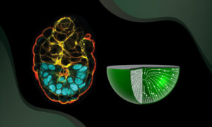
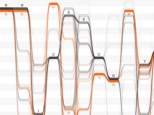
‘Sequence logos‘ are commonly used in genomics to visualise sequence motifs. The letters in motifs can represent the four letters (A, C, G, T) that denote DNA sequence, the four that represent RNA (A, C, G, U) or the 20 that represent amino acids (e.g. A, R, N, D, S).
Sequence logos (see above) are blocks of coloured letters showing where the letters in sequence ‘motifs’ are the same between different species. The more common a letter is at that location, the bigger (taller) it appears in the stack. For example, if a position is always an R, it will appear as a huge R. If a position is sometimes H and sometimes C, it will appear as an H stacked on top of a C, (like in position 4).
Sequence logos give a quick visual summary of similarities and differences between motifs in different species, which could indicate an evolutionary relationship or, in the case of proteins, a functional relationship. What they don’t tell you is how different parts of a sequence are related, or how a change in one position might be linked with a change in another.
No data left behind
“We wanted our visualisation to recover the information that gets lost when you make a sequence logo,” says Marek Kultys of Science Practice. “We were new to bioinformatics and didn’t know a lot about it, so we came to Hinxton and spoke with Nick and Roland, started exchanging ideas.”
Over the course of a few months, the designers collaborated with bioinformaticians to develop the idea of interactive ‘Sequence Bundles‘, which show dependencies and relationships between bases in different positions.
Sequence bundles, which look like fibre-optic wires, give researchers a new way to explore their data, and to bring potentially important relationships to light.

What does it do?
Sequence bundles are used in two different products: A web application developed by Science Practice and a Java-based desktop version named Alvis developed by Schwarz, who is now at the Max Delbrück Center for Molecular Medicine and the Berlin Institute for Medical Systems Biology. The desktop version integrates several ways to visualise the same data, including sequence bundles and sequence logos.
“You can upload a protein, DNA or RNA alignment and it will draw these motifs,” explains Goldman. “You can zoom in to see different regions of the sequence, scroll around, highlight things according to the patterns you’ve already seen, or click in the alignment and say, show me which residues are in this position. If you have an evolutionary tree relating the sequences, it can draw the tree and you can click on it to highlight subsets of the species you are studying.”
Each person’s genome is about 3 billion basepairs long, and plant genomes are often even longer. The desktop software can handle massive alignments, which are too big to be displayed on most screens. But given a large enough screen, one could use the tool to show relationships between bases that might be millions of positions away from one another.
New perspective, new findings
Sequence bundles make alignment data more accessible. They can clarify where differences in motifs occur, and whether they are correlated in different parts of the sequence.
“While we were working at it early on, I was playing with data representations in graphic design programs. Fiddling about with visual detail allowed me to explore the dataset and notice there were interesting patterns in the data!” says Kultys. “We collected those findings – little ones, like this position is correlated with that one, or this bunch of sequences look a bit unusual – and we shared our findings with the scientists who originally reported the data. They were surprised at what we’d found – they hadn’t noticed it before.”
Later, when the team was developing the Sequence Bundles web application, their goal was to to build a tool that allows users to play with visualisation settings, which could help them discover new relationships.
Designing for discovery
“Visualisations are so helpful,” says Goldman. “You can’t deny that they have a real impact. The clarity that comes with a good figure is reflected in how much time and care many scientists and journals devote to them.”
“Making something that helps scientists do their research better is a very rewarding, valuable experience,” says Kultys. “Bioinformatics is a field where design can have a big impact. Scientists make design decisions all the time, like when making genome browsers. But interdisciplinary input is quite important for getting this right. It was great working with Nick and Roland because they articulated their feedback well, in a way we could understand and act on. They also had real appreciation of our design input.”
But if the collaboration was enjoyable, and resulted in a tool that helps researchers, why do scientists and designers not collaborate more often?
It takes a bit of engineering to bring people from different disciplines and communities together. According to Kultys and Goldman, data visualisation conferences and interdisciplinary training are a good place to start. But there’s nothing quite like funding to make an idea take off.
“This worked because we had the right opportunities,” says Kultys. “After that first visualisation competition, we applied for Technology Strategy Board funding (currently Innovate UK), which we used to develop the Sequence Bundles web application in collaboration with the Goldman Group,” says Kultys. “We were able to go from a visualisation side project to building an actual visualisation tool.”
Synthesis
“Sciences such as bioinformatics or synthetic biology are not as much about analysis and breaking the world apart into atoms and subunits, but instead they focus on creating a synthesis of things that you’ve learned, elsewhere” says Kultys. “At Science Practice we like to think there is a natural role for design in those science activities, because they allow you to take a step back, juxtapose things differently, create something new — whether it is a synthetic organism or a re-interpretation of an evolutionary tree — and get a whole new view on biological questions.”
Sequence Bundles were shortlisted for the 2016 Kantar Information is Beautiful Awards, which ‘celebrate excellence and beauty in data visualisations, infographics and information art’.
Source articles
Schwarz, R. F., A. U. Tamuri, Marek Kultys, J. King, J. Godwin, A. M. Florescu, J. Schultz, and N. Goldman. 2016. ALVIS: interactive non-aggregative visualization and explorative analysis of multiple sequence alignments. Nucleic Acids Research 44:e77. Kultys, M., L. Nicholas, R. Schwarz, N. Goldman, and James King. 2014. Sequence Bundles: a novel method for visualising, discovering and exploring sequence motifs. BMC Proceedings 8 (Suppl 2):S8.
Related links
- Information Is Beautiful Awards ceremony on Wednesday, 2 November 2016 in London
- Announcement of shortlisting for Information Is Beautiful data visualization award
- Sequence Bundles official website
- Sequence Bundles visualisation web application
- Blog post by Science Practice about developing Sequence Bundles
- ALVIS desktop tool official website
- ALVIS video demo and tutorial