To affinity, and beyond!
Here’s a pretentious piece of jargon for you: “Affinity sorting.” It means “Writing stuff on post-it notes, sticking them on the wall and then grouping similar ones together.” And it’s a hugely useful exercise for prioritising content on websites.
Last week, Mark and I ran affinity sorting exercises with teams from Human Resources and Courses and Conferences to try to understand their needs for the new embl.org. Embl.org needs to serve all departments and groups at EMBL. The aim is to empower teams to look after their own sections of the website and to keep their content fresh and updated. And it’s a chance not only to improve content, but also the systems and processes behind the website. So we’re meeting people early in the project, and trying hard to understand their priorities.
But first, a tangent about shipping containers.
Stacking containers
The digital team is working on a Visual Framework for EMBL. This is a codebase that allows websites to present different types of content using a set of re-usable patterns, for a consistent look and feel across EMBL properties.
Imagine you are scrolling down on a website on the small screen of a mobile phone. There is no sidebar – the most important information must be presented at the top, the least important at the bottom of the list. It’s like a set of shipping containers stacked on top of each other: Each container could have a host of different things within it, but the modular design allows them to be easily ordered and re-arranged depending on priority. A simple, focussed way of understanding what the most important parts are. Read more about the container model of information architecture on this 2014 blog post from digital agency iA.
Affinity sorting with HR
We met with members of EMBL’s Human Resources department (Elke Jagomast, Jean-Paul Chidiac, Veronika Peclova, and intern Vera) to think about how to build a new “jobs” landing page for EMBL. We ran the following affinity sorting exercise:
Hello HR people!
Please write down the top three things that you think the user will need to do on the EMBL jobs page. One thing per post-it.
Suggestions included “Current vacancies”, “EMBL FAQs”, and “Save a job”. The 12 or so post-its go up on the wall, and are grouped by similarity.
We then repeated the task, with a new question:
What do you as the HR department for EMBL want the user to see on the page?
Suggestions now included “Terms and conditions”, “Life at EMBL”, “Exciting jobs that will make them want to apply”.
The final step is to take all those post-its and sort them into a single vertical line, with the most important at the top, least important at the bottom. This forces the HR team to seek a balance between what the user might want (a list of jobs) and what they might want to talk about (How great it is to work at EMBL). Here’s what they came up with, in descending order of importance:
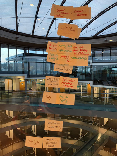
- Current vacancies
- Search filter
- Attractiveness of working at EMBL
- Salary and benefits
- Information about the recruitment procedure – how long does it take, how to apply etc
- Apply button
- Save the job for later
Alongside this, it was important for HR to distinguish between passive users – those who looked at a job listing but did not apply, for whatever reason, but may be interested in EMBL jobs in future – and active users, who applied for a job. They also stressed the importance of transparency – that the information should be honest and not over-state anything.
To our delight the HR team had a similar idea of the important parts of the process to us. And though these containers and their order may change as we iterate on the design of the page, we agreed that HR will now embark on a content audit of their pages, to decide on what needs to be kept, what needs to be deleted and what can be updated for the new “jobs” landing pages.
Affinity sorting with CCO
Geoff Barnett and Julie Heineke of the Courses and Conferences office joined us for a chat about the new CCO pages.
Their department has different challenges to the HR department, and we spent some time trying to work out how best to allow their conference registration system to directly display information on a website, without a duplication of effort on the part of the conference organisers.
Wouldn’t it be nice to just post a conference programme once, and have it display in all the relevant places around embl.org? It’s an ongoing discussion at this stage, and we are looking for technical solutions.
The conversation also flagged the danger of multiplying systems during a content migration. We don’t want conference organisers to have to update their current system, build a website in Fiona, and also have to do the same in Drupal, while under time pressure to register people and organise an event.
As for the content of a new site, we ran an affinity sorting exercise as described above, and Geoff and Julie came up with the following tasks, in decreasing order of importance, that users should be able to on their new site:
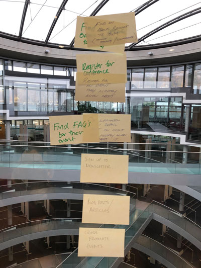
- Find an event relevant to them
- Register for the event
- Find FAQs about their event
- Sign up to newsletter
- Read blog posts or articles with information about courses and conferences
- See similar events to the one they have registered for (cross-promotion of other conferences)
Each item represents a container in our visual framework, and though most are list or text-based, we could imagine more work on making a beautiful “Sign up to the newsletter” container, for example, which could be re-used across EMBL websites.
We’ll be working on designs and technical infrastructure for a new embl.org/courses-conferences early next year. In the meantime, now you know why a website is like a stack of shipping containers.