A colour scheme for EMBL
The combination of logo, typeface and colour across different communications channels is at the heart of a distinct corporate design. In the last corporate design sprint, CDsprint 3, we turned our attention to colour.
Existing colour schemes
In my work as EMBL’s Art Director, I regularly use 3 distinct, legacy colour schemes:
1. EMBL base colours
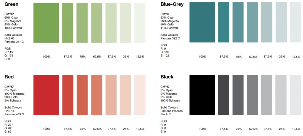
The base colours were established by EMBL’s long-serving senior designer, Petra Riedinger. These come from the red and green present in the logo, black, and a blue-grey colour commonly called petrol green within the organisation.
2. 40th anniversary colours
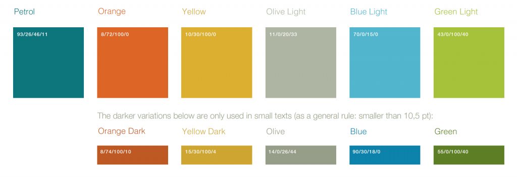
For EMBL’s 40th anniversary, design studio Edenspiekermann were commissioned to give EMBL’s news website a facelift. This resulted in an extended colour scheme that includes the petrol green. This colour scheme can be seen on both the news website and in EMBL’s magazine, EMBL Etc.3. Discovery colours
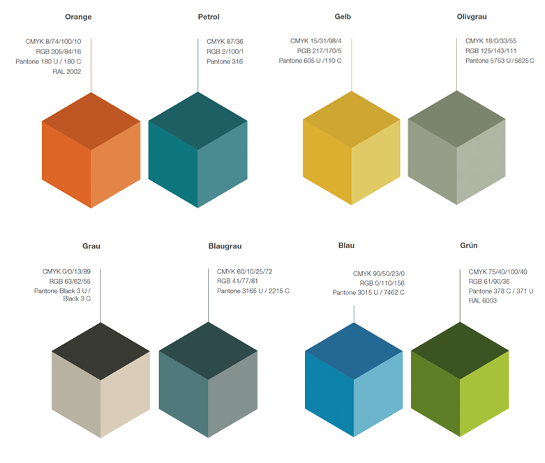
A third set of colours came from the work that Siteworks did for the Leben campaign and for EMBL’s discovery page.
A single colour system across media types
Our goal for CDsprint3 was to create a single colour system for EMBL that describes how colour should be used across media types and all touch points. We would therefore look at a variety of technical formats and their applications: CMYK, RGB, Hexcode, HSL, RAL and Pantone.
Colours for differentiation
We looked at how other institutes that are either similar to EMBL or work in the same domains. We developed a colour overview showing the primary brand colour of these institutes side by side:
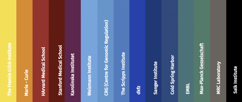
How does EMBL’s petrol green (4th from right in the figure above) sit besides the punchy yellow of the Crick or Cold Spring Harbor’s sober blue? It becomes obvious that our primary brand colour does not help to differentiate us from other organisations.
Other observations from this exercise were that blue tones are heavily used and that we thought that green tones are worth exploring.
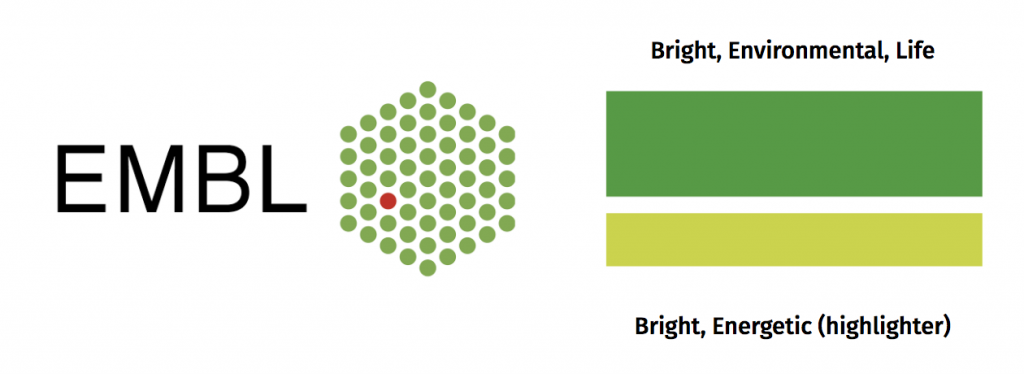
Green comes with many positive connotations, such as life, health, environment, energy, hope, growth and youth. These align really well with what EMBL does, who we are and how we want to be perceived.
Plus: the strongest corporate designs are based on the smallest visual element of a brand, which is the logo. EMBL’s logo uses green heavily: another good reason to explore green as a primary brand colour.
After much testing, we chose two types of green: one a deep, but lively green and another, to be used as a highlight colour, that is even more vivacious. Here’s how they sit next to the logo (which has a slightly ‘muddy’ green):
Back to our colour overview. How did our new green sit in the pack?
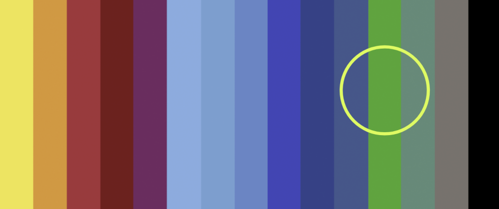
We tested this green in lots of different contexts and we liked it a lot. When I say we liked it, I mean that it performed its functions well in a variety of situations. It was distinctive, and yet it didn’t shout.
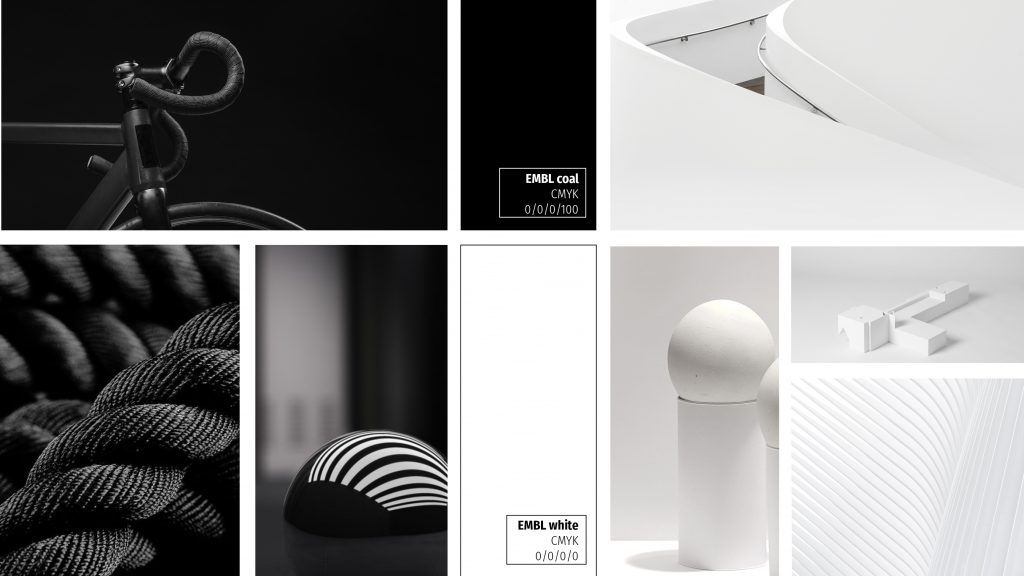
Mood boards
Based on this green, we created a new colour scheme for EMBL and will explore in the next sprints how to apply and implement it. The colour balance (f.e. how much whitespace will be used) will play an important role for the overall look and feel for the corporate design.
As a sneak peak of the new colour scheme, check out these mood boards:
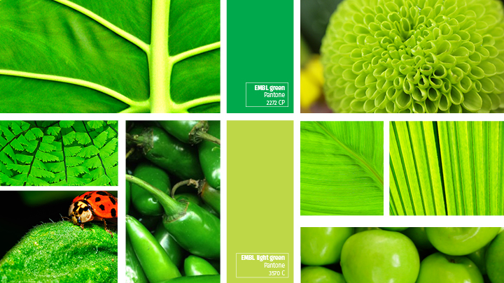
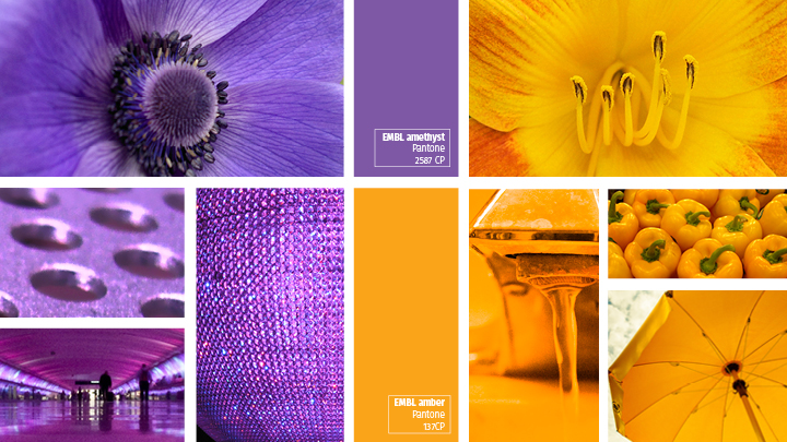
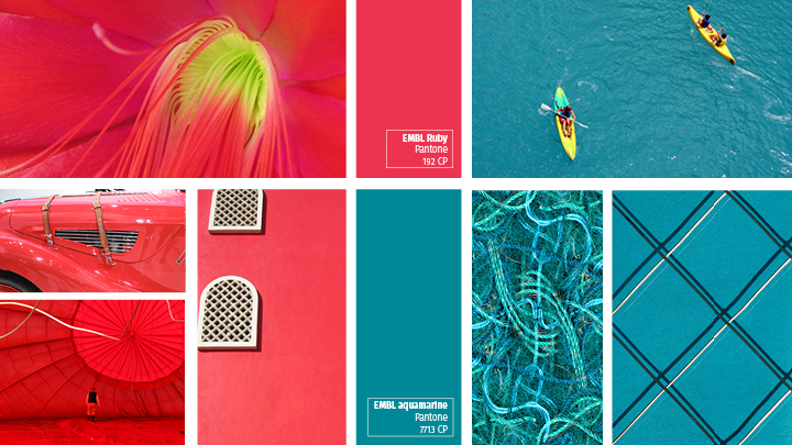
We defined the exact colour values for CMYK, Pantone, RGB, Hexcode, HSL, RAL, HKS, including a darker as well a lighter tint for the digital application.
Standard paper
We also defined a standard paper type to be used in EMBL’s print communications to ensure a unified finish and colour reproduction across all our print products.
We had quite a few requirements from our corporate paper choice:
- available across Europe;
- suitable for digital as well as offset printing;
- inline with the paper used by Photolab (our inhouse printers);
- available in a variety of many different grammages;
- availability of envelopes.
As coated we chose Maxiprime and as uncoated Munkenpolar.
Thank you!
Members of this sprint team are: Tabea, Spencer, Aleks, Iulia. Thanks for your great contributions and amazing team spirit! We look forward to showing you more on colours as we build out prototype products next year.