Corporate design sprint 2 retrospective
The second corporate design sprint (CDsprint2), led by Tabea, started to look at the thorny issue of sub brands: Does EMBL need sub brands, and if so, how should they be treated?
First, let me take a minute to outline what we’re doing here generally. The idea of these corporate design sprints is to work in an iterative, consultative and open manner to develop a new design system for EMBL.
A design system is a set of principles and tools that help designers and others who create things (whether it’s a document, web page or a sign) to align in what they do. It will helps us to be consistent and to be mindful of our values and goals as we create content for people with whom we want to engage.
These early sprints are all exploratory, but as we go further through the process, we will start to firm up the system into a set of standards and guidelines which we will document and then use whenever we design new things. For now, however, this work is merely foundational.
Recap on CDsprint1
Let’s revisit some of the learning outcomes from the first corporate design sprint. For me, there were two ideas that emerged that would be instrumental in guiding decision-making in future sprints:
- We will try to build a design system that works across media: whether it’s a printed brochure, an app or a building space, the same design philosophy should inform decisions.
- We will dial down the prominence of geography – EMBL’s sites – in the brand. Where something happened will be less important that what happened and who did it.
(See also Mark’s post on general design principles that the team is working to.)
There were also two very practical outcomes of the first sprint:
- The EMBL logo should always appear at the top right of the medium.
- The design team will trial the use of the Fira typeface.
Goals for CDsprint2
We set out to build on CDsprint1 and look at the following issues:
- Does EMBL need sub brands?
- How should EMBL’s locations be treated within the brand?
- Who are our primary audiences?
We set out to explore these questions with practical examples, and to produce very rough prototypes. These prototypes would be the primary outputs of the sprint.
We avoided all exploration of colour in the prototypes, and we also resisted the urge to polish prototypes to make them look good: we deliberately focussed on structure and system in favour of appearance.
EMBL-EBI and the EMBL brand
The European Bioinformatics Institute, or EMBL-EBI, is one of EMBL’s great success stories. From its humble origins as the EMBL Data Library in the 1980s with a staff of three, EMBL-EBI has exploded to become an essential service provider in bioinformatics for the global research community, and is becoming increasingly important to enabling work in the health, pharma and agricultural sectors (not to mention being home to groups performing world-class research). The reputation and reach of EMBL-EBI is so great that you could argue it enjoys greater brand recognition than EMBL itself. I would also say that significant segments of our target audiences are unaware of, or unsure of, the relationship between EMBL and EMBL-EBI.
Is this a problem, and how should we handle the EMBL-EBI brand within the EMBL design system?
We decided to approach the Directors of EMBL-EBI, Rolf Apweiler and Ewan Birney, directly: we were incredibly lucky that they were both able to join the design team at the kickoff of the sprint and committed their time to doing so. We asked them to consider the following simple brand relationship models:
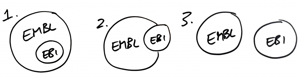
Which model, we asked, best describes the existing brand relationship between EMBL and EMBL-EBI?
Ewan gave us a great talk on the origins of EMBL-EBI and its current place in the research landscape. He also said that none of these models really quite describe the current relationship adequately, so he drew a new image that looked like this:
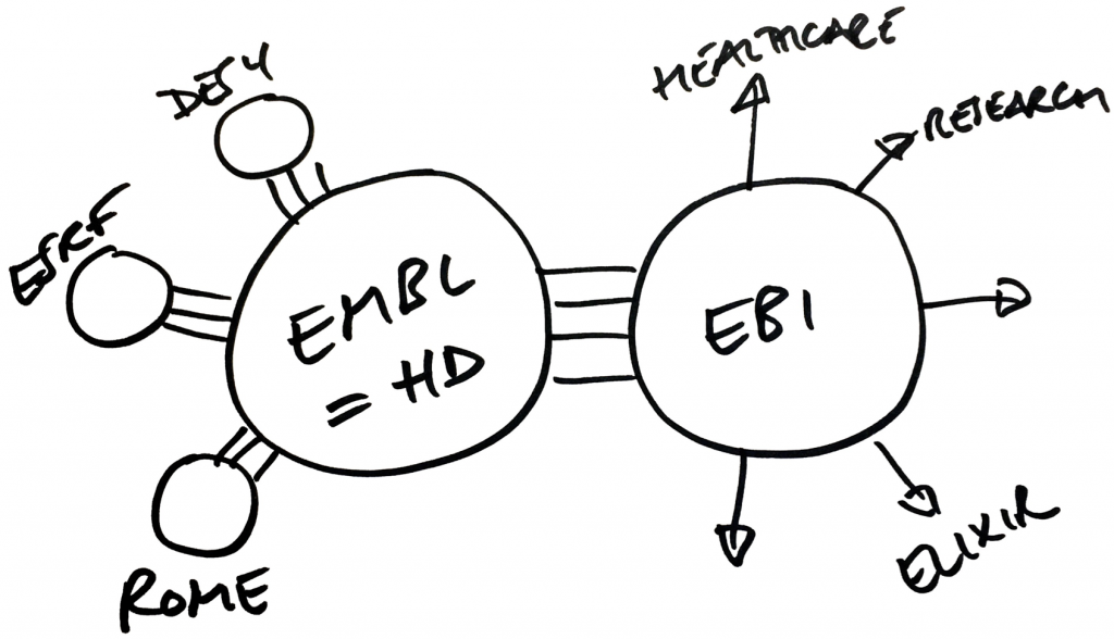
What’s particularly striking to me in this rough sketch is that the concept of ‘EMBL’ becomes ‘EMBL Heidelberg’ (Rolf pointed out that EMBL Heidelberg is perhaps the one entity that is lacking brand differentiation). I also see a ‘mothership’ relationship between EMBL Heidelberg and the smaller sites in this image, and the connections between, say, research in EBI and Rome, are not evident.
When asked which of our 3 models might best represent a desired future brand relationship, both Rolf and Ewan were clear that we should be aiming for ‘one-EMBL’ vision with EMBL-EBI clearly positioned as a key part of EMBL. However, neither Rolf or Ewan were fully convinced that the first bubble, showing EMBL-EBI within EMBL, was representative of the true vision we should aim for. We should be looking to position all of EMBL’s sub brands – whether it’s the Cell Biology Unit or Tissue Biology and Disease Modelling or the core facilities – alongside EBI. This includes the units and projects based in Heidelberg, and would give us something like this:
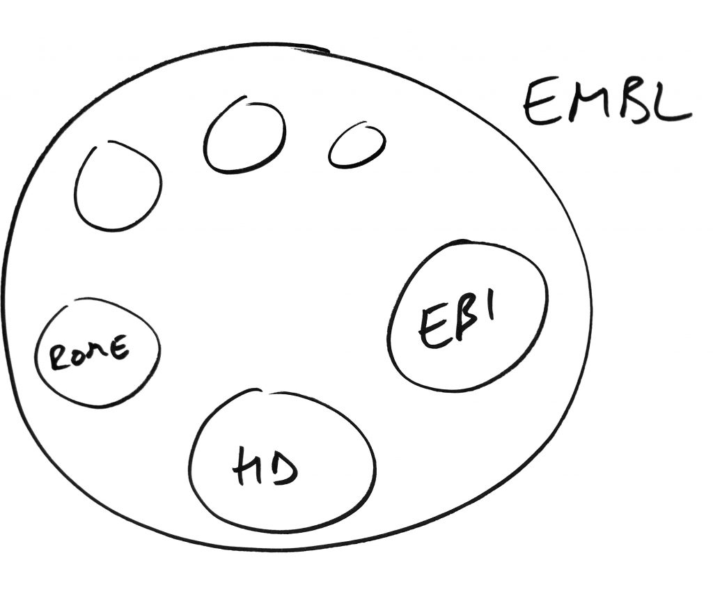
The conversation that we had with Rolf and Ewan was really informative. The key point for me was that we felt a clear steer for the design system to reinforce the idea (and the feeling) that EMBL is a single organisation, with EMBL-EBI being a constituent entity alongside all other sites and units.
A better way to talk about brand relationships
The design team did an awful lot of work following this conversation. They worked on prototypes, ideas, sketches and systems. Much of this is stuff that will be put aside – some of it to be, perhaps, resurrected at a later date. One thing that I think will stick and come in handy with our work as we go forwards in the new brand mapping tool that the team developed. It is based on two axes that can be used to map both brand entities and users. On one axis we plot how close to EMBL the entity or user is, and on the other how emotional versus rational their goals are.
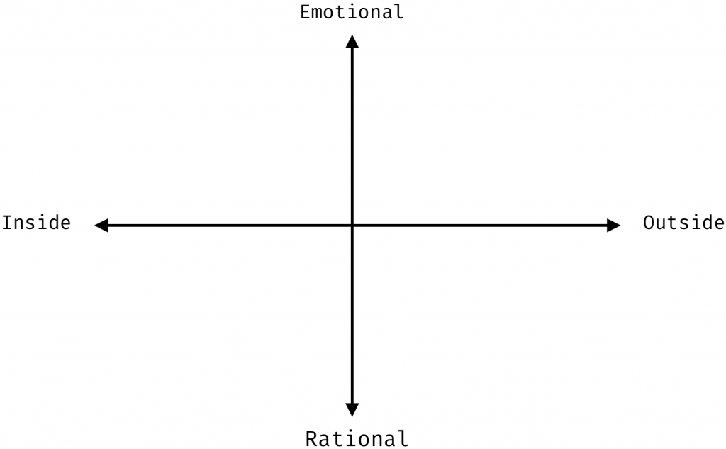
This tool allows us to have much more interesting and nuanced conversations than our simple bubbles allowed. Here, for instance, is an attempt to map certain EMBL brand entities as well as brands that coexist with EMBL:
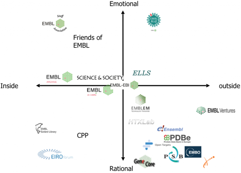
We’ll be using this model and we work with stakeholders in future to understand their perceptions of the EMBL brand.
Prototypes
Now on to some of the outputs of this sprint: let’s look at prototypes.
Health warning
These are not finished products, rather they are a way of building towards a system. Nothing is fixed in what you see, we are showing them to you for your input and ideas. We are interested in coherence, hierarchy of elements, scalability and clarity. Later, we’ll start to make this system look great. Think of these prototypes as the bones of our system.
The design team knows that these prototypes have issues that need to be addressed. We have already shown these prototypes to some people, and we already have some great recommendations to make the system behind them more coherent.
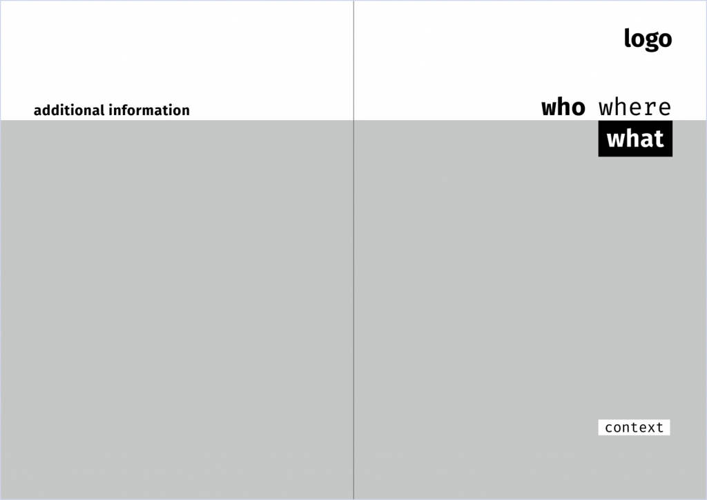
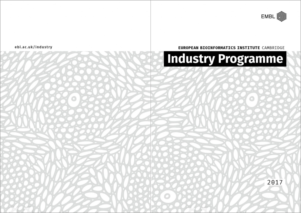
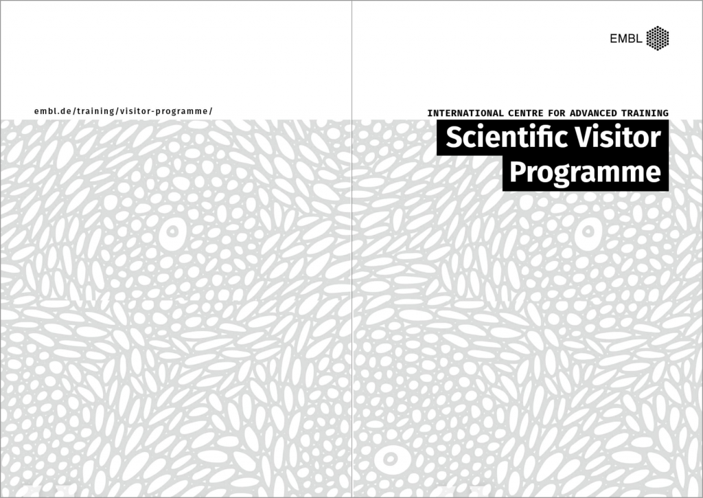
Brochure
First up is a system for brochures. The right-hand side of these prototypes represents the cover and the left-hand side is the back of the publication. At the top right is the EMBL logo. We always have the what element of the brochure, but most of the other elements are optional.
Here’s an example of what an EMBL-EBI industry brochure might look like in such a system:
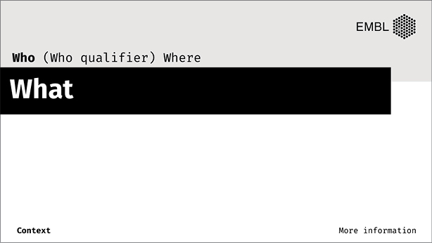
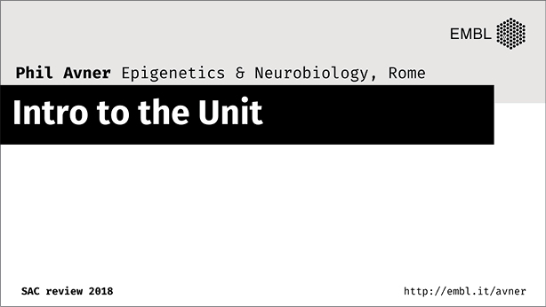
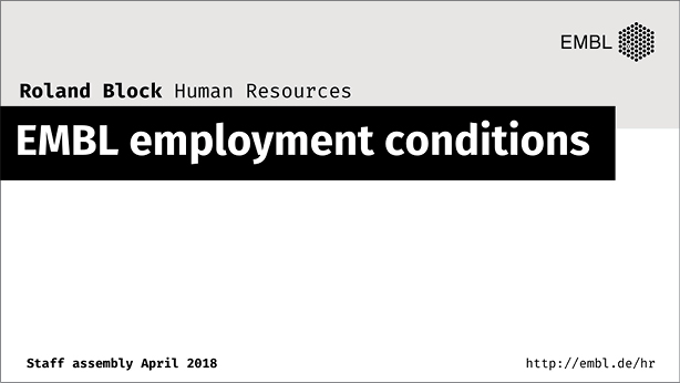
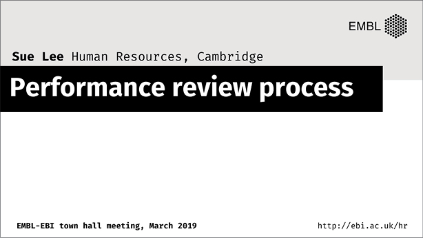
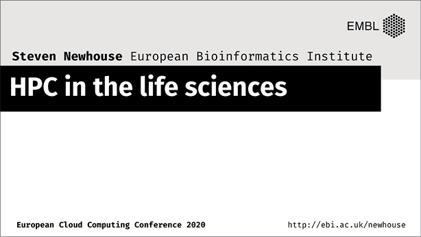
Slide deck intro slide
Next the team looked at how the what, where and who elements might work together on a presentation intro slide. This is really quite different to a brochure and we need to introduce extra information about the presenter. For this reason we introduced the who qualifier element:
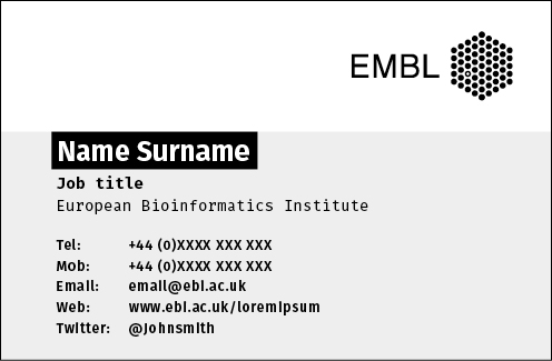
Business card
And finally, a business card. Again, we wanted to build the feeling of a single organisation and therefore the EMBL logo is consistently at the top right. In the context of a business card, the who becomes the dominant content element.

Feedback we’ve already had on these prototypes
A key piece of feedback that we’ve had already, both from the Strategy and Communications Advisory Committee and from the Directors of EMBL-EBI, is that we need another placeholder in the structural hierarchy to represent EMBL-EBI (or to put it another way, major sub brands of EMBL, of which we currently have one: EMBL-EBI). The ‘who qualifier’ and ‘where’ elements are not sufficient to represent EMBL-EBI consistently or to position other elements as being within the scope of EMBL-EBI.
I think two of these prototypes really point to this need: the intro slides for Sue Lee (prototype 10) and Steven Newhouse (prototype 11).
This is really useful feedback and we’ll look at incorporating it into future iterations.
Your feedback
What are your thoughts on these prototypes? Are we heading in a good direction? Have we overlooked things? Do you have ideas on how to improve them? We’d love to hear from you.
Feel free to leave comments on this blog post or get in touch with me or Tabea directly. If you have a group of people who’d like to give collective feedback or input, we’d love to come and talk with you and show you more.