Selecting a new typeface for EMBL: Fira
[This blog post was penned by the entire team that took part in the first Corporate Design sprint]
We have been using Helvetica Neue as EMBL’s official typeface for some time now. We wanted to test whether this is the best and most sustainable choice for the organisation moving forward. There are few fonts as iconic as the Helvetica family, but it also comes with baggage:
Too popular: Helvetica has been used everywhere from the New York Transit Authority, to American Airlines, to Lufthansa. It’s so familiar and ubiquitous that it is somewhat voiceless and utilitarian. It adds no value to the EMBL brand.
Licensing: Many computers come bundled with Helvetica. But not Helvetica Neue, so we’ve had buy licenses to use it on our many print products, websites, and service websites. Using Helvetica Neue is expensive.
Readability: The different weights of Helvetica aren’t the most successful when displaying on screen (not so shocking for a typeface from 1983). Similarities between letterforms (1, l, i, ll, for example), and low contrast between the stroke weights in each letterform, make readability a problem.
Browser woes: Helvetica Neue doesn’t render well on Windows. Or screens for that matter. This was the driving decision for Apple to move away from Helvetica Neue on iOS to their own typeface, San Francisco.
Confusion between Helveticas: The many flavours Helvetica comes in causes confusion: Helvetica, Helvetica Neue, Helvetica Neue pro, Helvetica rounded…
In short, we have a problem with our current typeface. It’s not surprising, therefore, that an organic conversation began about what we need in a typeface. Here’s from the EMBL-EBI Web Guidelines Committee at the start of 2017:
Feeding back in some recent conversation at the January Web Guidelines Committee and with our colleagues at EMBL; want in future a font that has:
 • A variety of weights and styles (light, ultra-light, bold, italic, etc.)
 • Support for foreign characters (You guessed it: I'm looking at ü). Also for non-Latin script, e.g. Greek, for scientific notations
 • Consistent rendering across the many devices/browsers
 • Looks good at small sizes (so we can use it for data tables and visualisations)
 • Not too radical a deviation from Helvetica (using a serif as the primary font is likely not an option as it would blow up too many applications)
 • Huge bonus points for a liberal or open source license
 • Nice if the font has a little personality (Helvetica, for example, is very generic and does not make our "brand" more recognisable)
 harmonising with Helvetica (the font in the logo)
 • Bonus points for: working well in print, being a font family which offers sans serif and serif font styles and being a highly legible, scannable font
All of these are great criteria for guiding our choice. For us, the need for a typeface that could work across our content, whether in digital or print, was more than a bonus point – it’s one of our design principles.
In this first design sprint we tested many fonts, but none really stuck. These include:
- Roboto: https://fonts.google.com/specimen/Roboto
- Raleway: https://fonts.google.com/specimen/Raleway
- Lato: https://fonts.google.com/specimen/Lato
- Calibri: http://www.identifont.com/find?similar=calibri
- Open Sans: https://fonts.google.com/specimen/Open+Sans
- Lucida: http://www.identifont.com/find?similar=Lucida+sans
We won’t break down each of these, but in short they were all either too generic, a bit too rough, or lacked in weights.
An initial contender was the humanist font Ubuntu (http://font.ubuntu.com/about/):
Specimen from https://www.fontsquirrel.com/fonts/ubuntu
It’s well designed and comes from London-based type foundry Dalton Maag. however the initially attractive curves and personality began to feel sour the more we used it and its readability in blocks of text became a growing concern.
We also considered Noto, but again we found concerns here — so we decided to let the issue rest until Heidelberg and Cambridge teams could physically get together.
Getting serious
With the arrival of the Corporate Design Sprint in June, we not only had a chance for three EMBL designer-y types to get together in the same space:
- Tabea Rauscher: Art Director, EMBL Heidelberg
- Spencer Phillips: Senior Graphic Designer, EMBL-EBI Cambridge
- Ken Hawkins: Web Design Architect, EMBL-EBI Cambridge
We also had a ”bonus” consultant: Mark Boulton, a digital designer with typographic design experience.
We finally had a chance to share thoughts together, incorporate organisational needs and get some extra guidance/inspiration thanks to Mark.
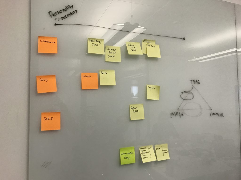
Looking at superfamily fonts, serif fonts and sans and graphic along a x-axis of “personality”.
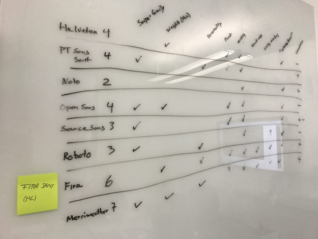
In week two of our sprint went around more than a few times developing various grids and matrices:
We also tried to numerically assess what each offered.
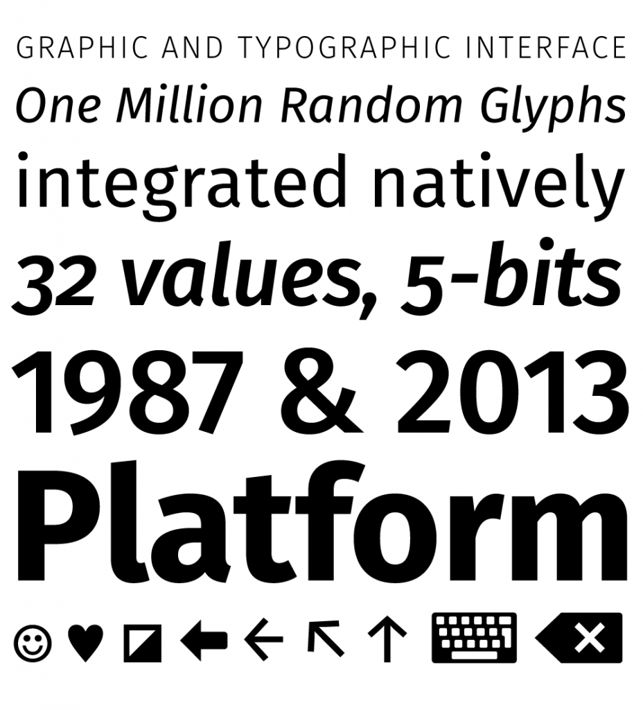
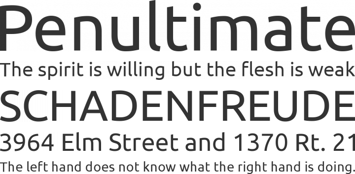
Ultimately, it took Mark’s suggestion and advocation of Fira Sans to finally tip the scales.
Specimen from http://typographica.org/typeface-reviews/fira-sans/
Fira Sans is an open license (SIL) font developed by Erik Spiekermann for Mozilla’s now-defunct Firefox OS. Though a sans serif typeface, Fira’s characterful letterforms were enough to convince us that we can sidestep the issue of finding a serif typeface with which to pair it with (for now, at least).
After all, technically EMBL has no official serif typeface – although the Sentinel typeface has made inroads through a set of product guidelines that don’t align well with core brand guidelines.
So how does Fira measure up? Let’s revisit our checklist:
- A variety of weights and styles (light, ultra-light, bold, italic, etc.:
Yes! 17 - Support for foreign characters (You guessed it: I’m looking at ü):
Yes. (Although it seems some Greek characters aren’t so elegant) - Consistent rendering across the many devices/browsers:
Yes. Designed with a mobile OS in mind. - Looks good at small sizes (so we can use it for data tables and visualisations): Yes.
- Not too radical a deviation from Helvetica:
Yes. Fairly similar widths. - Liberal or open source license: Yep!
- Nice if the typeface has a little personality: Yes. Slightly humanist and the Mozilla connection is a nice nod.
- Harmonising with Helvetica (the typeface in the logo): Yesish. Initial signs say this should be ok, more testing is underway.
Bonuses:
- Versions available for web and desktop.
- Also available on Google Docs.
- Fira inline capitals share an x-height similar to non-cap phrases, which is great for readability WYFHALOA (when your field has a lot of acronyms)
- Monospace and ‘code’ monospace available.
We’re currently putting it through paces in print and online before we do further open testing. Until then: play with Fira here.
After a year or so of hand wringing and lack of direction, it’s nice to have a single choice to test and asses. Fira: Success!
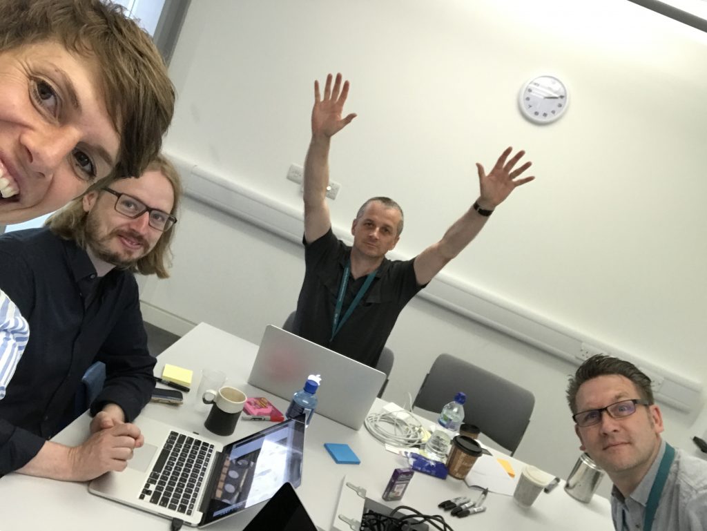
Tabea, Ken, Mark and Spencer all take in the sweet relief of making a choice.
Photos are thanks to Tabea’s documentation efforts.