Highlights from the 2019 Visualizing Biological Data (VIZBI) Workshop
Meeting report by EMBL event reporter Dagmara Kaczynska
In March I had the amazing opportunity to take part at the 10th Visualizing Biological Data (VIZBI) workshop as an EMBL event reporter. This year VIZBI lasted for 3 days and included various sessions: DNA, RNA, Proteins, Cellular Systems, Tissues & Organisms as well as Populations & Ecosystems. As it was my first VIZBI conference I had wondered how it is possible that one workshop contains such a diversity of topics. Who is the audience? Who are the speakers? Even if you missed the VIZBI workshop this year, let’s relive it together.
What is VIZBI?
To start uncovering VIZBI let’s first visit the website. It shows that VIZBI focuses mostly on how data is represented, not only what it presents. What’s more, we learn that the audience consists of a variety of crafts such as scientists, medical illustrators, graphic designers, artists and computer scientists. This multidisciplinarity is also visible in the program of the conference. Although most of the speakers are researchers, we can also expect talks from statisticians, computer scientists, animators and data visualization experts. This collaborative approach of VIZBI makes it possible to find common patterns and guidelines to make a good visualization of biological data. Most importantly, participants of the VIZBI conference believe that good visualization is the key to scientific communication.
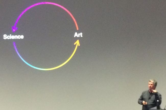
While thinking about a visualization, think about data first
To begin with, let’s slice and dice the ‘biological data visualization’ concept by asking – what is visualization? As the first keynote speaker, Hadley Wickham, pointed out most of us has a very different perception on what it actually means.
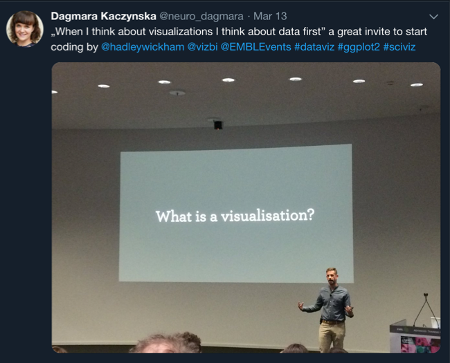
As the workshop touched upon topics varying from DNA to ecosystems there are also many ways to visualize them. Regardless of the field of study, Hadley Wickham recommended to ‘firstly, think about the data’. The main goal is to decide on a message and a story behind the findings. After answering these fundamental questions one can start looking for the best means to visualize them.
Biological data is complex
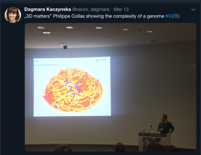
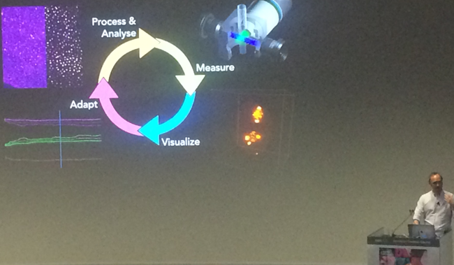
Following his recommendation, let’s take a look at data presented during the conference. It was not surprising to learn that biological data is, quite simply, complex – regardless of whether one studies genomes, proteins or tissues. Philippe Collas discussed the complexity of a genome, composed of various elements, that forms different structures. He made a point by saying that ‘three dimensions (3D) matters’ and an image is just a representation of a real case scenario.
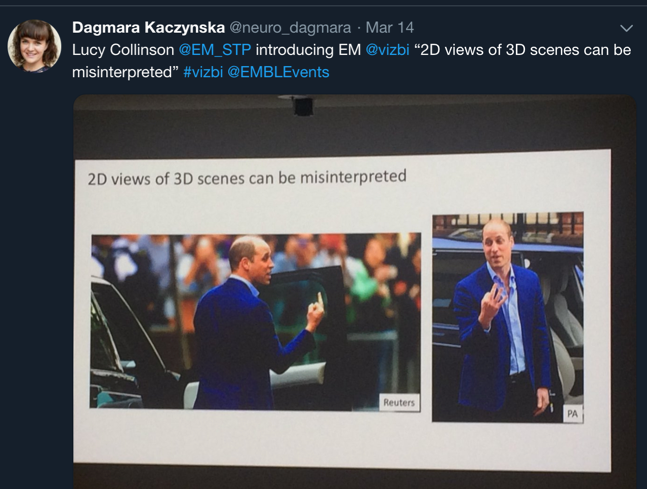
Life happens in 3D so images cause danger of misinterpretation
Almost all the speakers mentioned that life happens in 3D, which causes many struggles in the visualization and interpretation of data. When Lucy Collinson introduced electron microscopy data she emphasized that 2D views (such as images) of 3D scenes (such as proteins) can be misinterpreted.
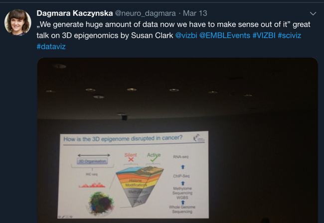
However, this problem concerns all biological fields. For example, Philippe Collas and Andy Yates discussed the complexity of a genome. Susan Clark presented how the 3D organization of epigenome is disrupted in cancer.
Moreover, Marc Baaden tackled the difficulties of recapitulating dynamics in a static image. In contrast, Loïc Royer showed 4D videos of morphogenesis and challenges with microscopes such as focus or stabilization of images as well as the importance of digital image processing.
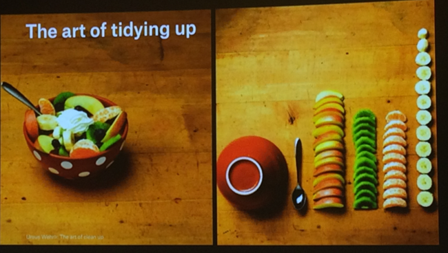
Data and visualizations need to be cleaned and structured
In order to form the main message of a discovery, one needs to understand the complexity of data. Many speakers advised to clean and structure data as a first step of analysis. Here, Moritz Stefaner showed the image from Ursus Wehrli ‘The Art of Clean Up’ to represent the art of tidying up.
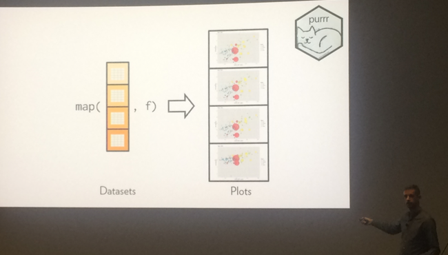
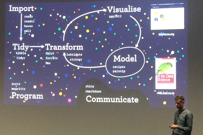
What’s more, structuring your visualization will help an audience understand the concept better. Hadley Wickham believes that orthogonal components make it easier to compare and remember (in this case using purr library in R).
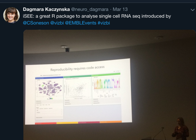
Data analysis needs to be well documented (preferably in a form of code)
It is obvious that the analysis of biological data is not trivial. What’s more, one set of data may lead to many different observations. Most of the speakers drew attention to the importance of documenting data and pipelines of analysis. Many advised to use codes. ‘A code is readable, reproducible text’ as Hadley Wickham presented. Most scientists, especially those from RNA and DNA fields such Charlotte Soneson, Irmtraud Meyer and Wolfgang Huber, shared the same opinion.
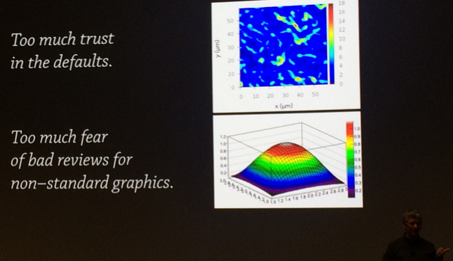
Data needs story for visualization
Now, when data is cleaned and tackled it is time to decide on the message and a story. Then, one can investigate possible ways of visualizing the findings. How can one find the best way to visualize data? Probably the most common advice was by trial and error, learning what others do, using design concepts, consulting with others. However, if you really have a clear purpose it will be much easier. Moritz Stefaner also believes that scientists have too much trust in the defaults. For example, he showed that rainbow gradient is not necessarily the best one!
Data analysis and visualization need iterations
According to Moritz Stefaner, Loïc Royer and Hadley Wickham, iterations are the key for a good data analysis and visualization. Prototyping and modifying should be a habit of all scientists. Only by iterating can we create something of great value and importance. One needs to ‘create a bunch of bad visualizations that need to be iterated as long as you find the best solution’ Hadley Wickham summarized.
Illustrations and animations capture the complexity of data
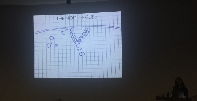
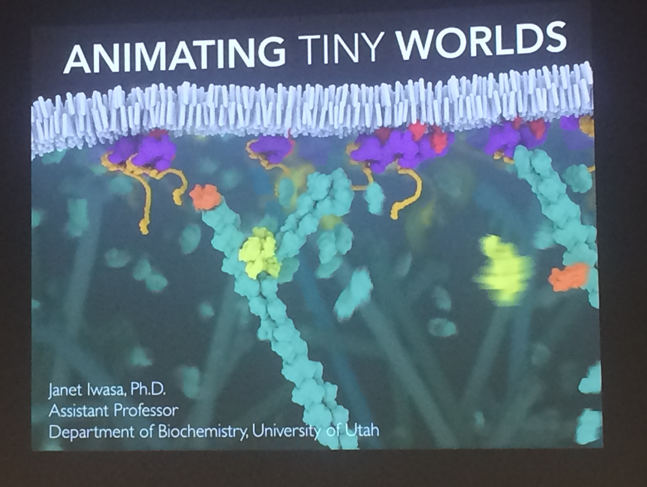
As mentioned above, the VIZBI society cares and makes an effort to prepare good visualizations. They believe that visualization is the key to every communication – illustrations and animations make a concept easier to understand. A recipient is able to grasp a research idea much faster. Janet Iwasa also showed that animation enables showing the complexity of biological data as they are in 3D. It can make a hypothesis more accurate and discoveries much clearer. She compared a model figure with a snapshot of her animation to illustrate the difference in perception. What’s more, to make an animation one needs to fully understand a concept to illustrate it, which makes a finding more precise.
Conclusions
To conclude, although at first sight it seems that all VIZBI session are very diverse, in fact they have a lot in common. All present ways to visualize biological findings based on data. Having said that, the data and visualization techniques are very versatile, but there is a common pipeline. To make data clear to everyone the clue is to find the best way to visualize it by iterating and modifying different solutions. In order to find the best means we need to focus on a main message and story. To create a story we need to fully understand the data by cleaning, structuring and analyzing. Keeping a good documentation in the form of codes, storyboards and notes make findings transparent and reproducible to others. Communication is key in the progress of science, and scientists can improve their visualization methods and skills. VIZBI participants believe that it is worth putting in a lot of effort to make data more understandable and memorable.
Remember to have fun and use your creativity! I definitely had a lot of fun as an event reporter at the 2019 VIZBI workshop, and will incorporate all these lessons in my daily research.
If you have any questions or would like to discuss biological data visualization, please write me a message.
All the images were taken during the conference using private phone. All the images are set to presenter’s names. There are no images of slides that presenters asked not to tweet about.