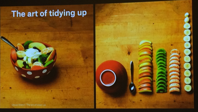
7 ways to illustrate your work to broaden its impact
The effective visualisation of your results and ideas improves the discoverability, accessibility and impact of your work.
As visual culture and science historian Geoffrey Belknap concluded in an essay for Nature last year: “The visual continues to work as a foundation for making sense of data. The tools, as we have seen, have radically changed. The power of images has not.” (https://www.nature.com/articles/d41586-019-03306-9).
Condensing your key findings into simple, visually appealing illustrations and infographics allows you to share your work on more diverse platforms and with more diverse audiences, increasing the reach and impact of your science.
Whether you work in collaboration with a graphic designer, or whether you apply key principles of design to your communication yourself, the following aspects are important for the effective and compelling visual presentation of data and ideas.
1. Tell a story through design
Humans seem almost programmed to connect with stories on both an intellectual and emotional level. As such, stories are powerful tools for communication. When creating an illustration or infographic, think about what story you want to tell and how it will engage your audience: What ‘characters’ (in this context, usually: genes, cells, pathways, diseases etc.) should be the focus of the story? Who is the story for and what interests them? Can you connect your story to their interests? What emotions do you want them to feel? The answers to these questions will help you focus on the aspects of your discovery that need to be prioritised and how to visualise them.
2. As complex as necessary, as simple as possible
If you are creating an infographic for specialists in your own field, then you can use specialist language and make assumptions about the prior knowledge of your audience. The further away your audience is in terms of expertise or experience from your peers, the more background and context you will need to provide, and the simpler your language and the concepts you illustrate will need to be.
3. Conceptualising is exploring, so draw sketches first
Just as you might conduct exploratory experiments before committing to a research approach, explore your storyline from different angles to see what works for you, your message and your audience. This is done most effectively by sketching ideas by hand in black and white. Experience shows that using software for this exploration can be distracting, either because the tools are not intuitive, or because the colours and options available in software steal focus from the goal: to find the compelling visual idea.
4. Loop the loop to refine your ideas
Think of the design process as moving forward in loops, rather than as a straight line. When you feel like you have a good idea, revisit it and ask yourself: Are all the elements shown key to the story, or can I leave some out? Simplifying means that you will communicate more clearly and that your audience will more quickly understand what is presented.
5. Design tools: use them effectively by using them sparingly
Once you are happy with your concept sketch, it is time to draw the final artwork. In your concept sketch, you laid out all the elements and probably already made some decisions about sizes and composition. You will now make additional choices about fonts and colours. As tempting as the numerous options might be, try to be restrained in your choices to ensure the graphic is clear and legible: One font with four font faces (regular, italic, bold, bold italic) and two or three colours initially are often sufficient to distinguish elements. You can always add more colour later if necessary, and starting out simple helps you to not clutter your illustration. Revisiting your artwork frequently helps you to keep it as simple as possible and as complex as necessary.
6. Plan your media strategy ahead
A lot of time will go in developing the idea for your graphic and drawing the actual artwork. Spend some time early on to think about how you can best use the same artwork across multiple communication channels. Different media require different sizes and file formats. To cater for this variety, draw you artwork using vector-based software like Adobe Illustrator or Inkscape. Vector-based illustrations, unlike pixel-based illustrations, can be scaled up or down without any quality-loss.
7. Attention is a limited resource
Thousands of articles, ideas and information are communicated daily, so people browse content quickly. If your graphic is eye-catching and easy to understand at a glance, it will both draw your reader’s interest to know more, and give them the key message about your findings in only a few seconds.
Sandra Krahl runs a course for EMBO Solutions on Applying Design Principles to Schematic Figures for scientists – for more information and to register, visit http://lab-management.embo.org/dates/design
Original video with Tabea Rauscher, Design Team Lead at EMBL, and Sandra Krahl, EMBO Alumna and Senior Graphic Designer and Illustrator