Happy birthday VIZBI!
By guest blogger, Helena Jambor, PhD, TU Dresden, @helenajambor
10 years after it all started, VIZBI came back to its original stomping grounds, the ATC at EMBL in Heidelberg. As its name suggests, VIZBI “Visualizing Biological Data” is a blend of several worlds. Of biology, with its long history in visualizations that goes back to Ancient Greek text books, and of art and scientific illustration.
VIZBI is also inseparable from computer science and its tools to transform big data into human readable entities. And finally, VIZBI incorporates concepts of design and visual perception to make visualizations engaging and enlightening.
Highlighting spectacular biological images
At VIZBI 2010, microscopic images were omnipresent. Back then, I was embarking on my postdoc project, a large-scale microscopy screen of RNAs in cells. My memories tell me that this was the main focus of the conference. Indeed, a quick check of the 2010 program confirms that almost the entire community of light sheet microscopy and image processing were in attendance at the first ever event.
VIZBI 2019 continued to highlight spectacular biological images. A phenomenal augmented reality installation showed them in 3D, EM-tomography simulations by Peijun Zhang animated the 64-million atoms assembling into HIV particles, and Lucy Collinson shared the high numbers of high-resolution EM data collected at the Francis Crick Institute. This large amount of data is annotated with the help of amateurs, for example in their citizen science project at the Zooniverse “Etch a cell”.
Colourful confocal images or images of tissues also provided the inspiration to many works of illustrators on display that combined science and art, for example the double win of best poster and best art to a depiction of tubulin in a mitotic spindle by Beata Mierzwa @beatascienceart, a hugely talented artist and scientist (who also sells cool cytoskeleton-printed leggings and mini-brain organoid dresses).
Data visualization
At VIZBI 2019, visualizations of data – as opposed to images – gained a much more prominent spot. All keynote speakers were from the technology side. Hadley Wickham presented the history of ggplot2. Ggplot2 (and yes, there once was a ggplot1!) is the R universe for visualizing pretty much everything that comes in numbers and is now merged into the tidyverse. Being a visualization talk, all slides were themselves beautiful, I love the tidyverse playfully represented as stars of our universe! The second keynote was by Janet Iwasa who presented her animation work that heavily relies on 3D and computer graphics software used for animation films. Instead of earning her money in the film industry, she decided to put it to good use for biology. Janet first used her skills in her PhD project to visualize motor proteins “walking” along the cytoskeleton, and these days produces Oscar®-worthy movies showing biology, such as the origin of life or the life cycle of HIV. And everyone take note: all her films start as a storyboard on paper, which is what I teach as good practice for all visualization designs.
Making the invisible visible
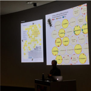
The third keynote was by Moritz Stefaner, a data designer who is enticed by biological data but appalled by the time-scales in biological projects (too long!). Luckily, he hasn’t given up on us just yet, and keeps producing phenomenal visualizations. For example, showing absence and loss is notoriously hard, but Moritz found a beautiful way to make the invisible visible in his designs for “Where the wild bees are” with Ferris Jabr for Scientific American.
Moritz left us hungry for more when also showing his data-cuisine project, that visualizes data about food and turns food into data: the number of berries picked in Finland become a layered dessert, and common causes of death are encoded as praline fillings – you never know which one you’ll get! (Luckily this was with Belgium pralines, so all deaths are sweet.)
Feedback wanted!
Visualizations of data were in the spotlight of many other projects too. This is of course owed to the many possibilities of large-scale methods that swamped biology with data in recent years: RNAseq, inexpensive genome sequencing, mass-spec at fantastic scales, robotics driven biochemistry and medicine, image processing that turns images into insights by quantifying signals and so on. RNA sequencing, for example, fuelled Susan Clark’s project tracing methylations in cancer, Phillippe Collas’ ambitious endeavour to understand 3D genome architecture, and is empowered by Charlotte Soneson’s “iSEE” software to interactively analyse data from high throughput experiments and the project of Kirsten Bos tracing human pathogens back thousands of years by sequencing tiny dental samples. And of course, of the biggest data projects in biology is the ENSEMBL genome browser, which was officially released as pre-alpha version VIZBI (check it out: 2020.ensembl.org), the very approachable Andy Yates and his team are looking for feedback!
Technical Challenges
Visualizations of high-dimensional datasets are not without problems. The technical challenges were addressed by David Sehnal who showed computational infrastructure to visualize protein structures (MolStar). The mathematical problems of dimensionality reductions were a topic of Wolfgang Huber’s talk, and a tool to visualize, and thereby find(!), batch effects, “proBatch”, was presented in the flash talk by Jelena Čuklina (they welcome beta-testing by users!). Teaching science visualizations, I often see a great need to discuss ethical and practical aspects. Critically assessing limitations and challenges of scientific visualizations might be a topic to be expanded in future, when VIZBI enters its second decade. This should be coupled with visual perception research, after all, we are no longer limited by computational power, but rather by what our eyes and brains can comprehend (see Miller 1956).
Flash talks
Speaking of flash talks: the conference organisers did such a great job in highlighting every single one (!) of the posters by one-minute talks. I tremendously enjoyed them, admittedly in part because I have a short attention span. Among the talks and art was also “Data dancing” by Alex Diaz. He showed that art and beauty can also be found in statistics and numbers blossoming like flowers across the page. On that note: see you next year in San Francisco!
P.S. Many more highlights I was unable to cover here. Check https://vizbi.org/2019/ for all posters and slides of the flash talks, check #VIZBI on twitter and my public collection of participants twitter handles (https://twitter.com/helenajambor/lists/vizbi2019).