On EMBL’s graphic design history
“Look back to move forwards” is a well-known saying. Thus, I recently turned to EMBL’s archivist, Anne-Flore Laloë, who helped me to search EMBL’s amazing archive to learn how EMBL has depicted itself through the years. Maybe knowing more about our first visual identity could help us better project ourselves today and into the future? It was an inspiring travel though time and provided useful hints for the next steps of EMBL’s new corporate design.
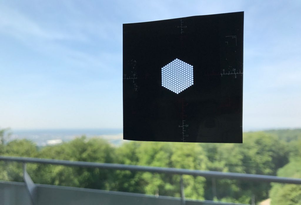
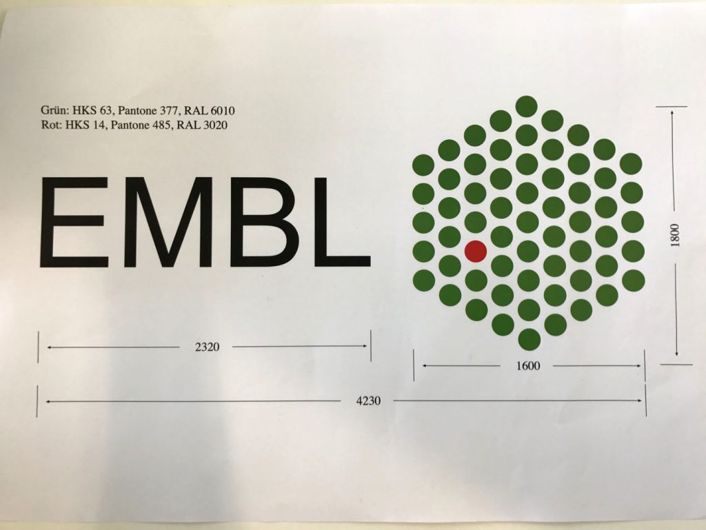
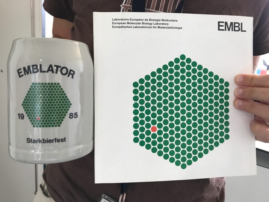
We started by reminding ourselves of the history of EMBL’s logo. Today, we are well familiar with its 61 dots, organized in a hexagon, balanced on a peak. But what is it supposed to represent? Where did it come from? Why is one of the spots red?
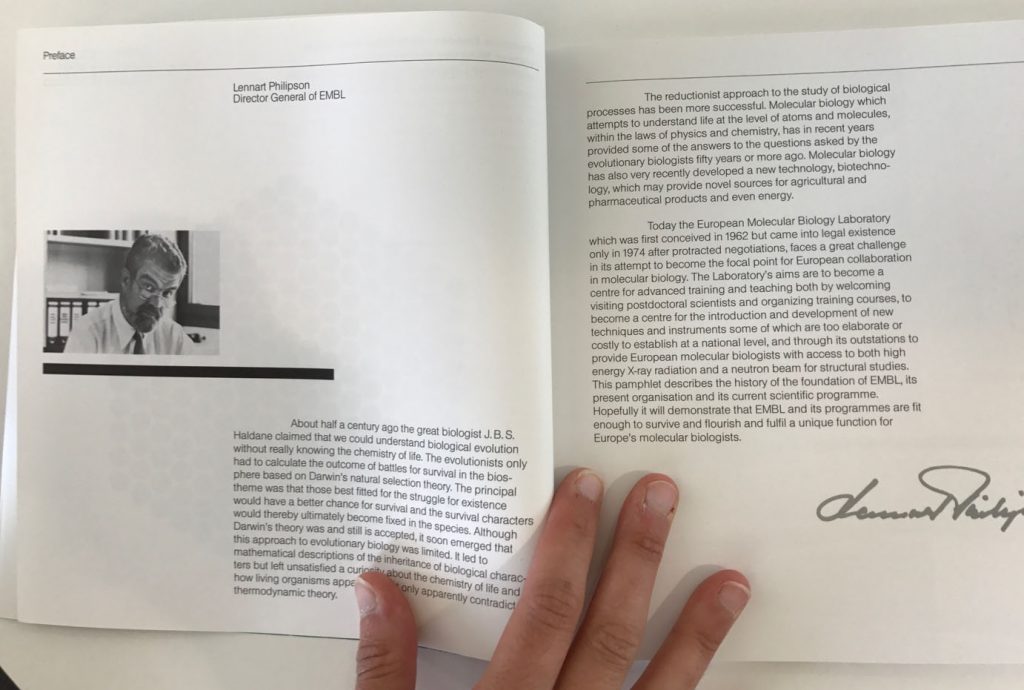
The initial design of this logo has been claimed by or attributed to several individuals. What seems pretty clear is that it was commissioned by Lennart Philipson, the second Director General of EMBL. Philipson was a microbiologist who specialized in the study of respiratory viruses. One of the viruses he studied, in particular in his lab at Uppsala University in Sweden before taking on the post at EMBL, was the adenovirus.
When [head of Human Resources] Konrad Müller asked Lennart Philipson for a logo for EMBL, Philipson therefore naturally thought back to the adenovirus. The virus’s hexagonal shape could be thought of as representing all the laboratories in Europe, with the red spot being EMBL, now fully integrated in the European map. The location of the red spot was close to its position on a (very) schematic European chart.
But there’s also a different possible interpretation of the red and green. David Meyer, who was a group leader at the time, worked with Müller to turn Philipson’s idea into a usable logo. He remembers the green being said to stand for thought, and the red being the sparks of discovery that EMBL would bring.
The adenovirus is shaped like a Sputnik space capsule. “In more technical terms, its capsid – the outer shell of proteins that encloses the DNA genome – is not spherical but shaped like a regular icosahedron with twenty triangular faces and 12 vertices,” Stephen says. “The 20 faces are made of the major capsid protein called the hexon, 12 of which tile together to form a flat triangle (hence a total of 240 hexons in the virus). However, to get a closed shell, the vertices where the points of the triangle meet have to be made of proteins that form a pentagonal structure called the penton base. This is just like the hexagons and pentagons on a football.”
Full stories in the EMBL Annual Report 2003-2004: the interview with Philipson is on page 87, and an article about on the adenovirus is on pp. 82-86: EMBL Annual Report 2003/04.
The structure of adenoviruses morphed into EMBL’s logo. ANIMATION: EMBL
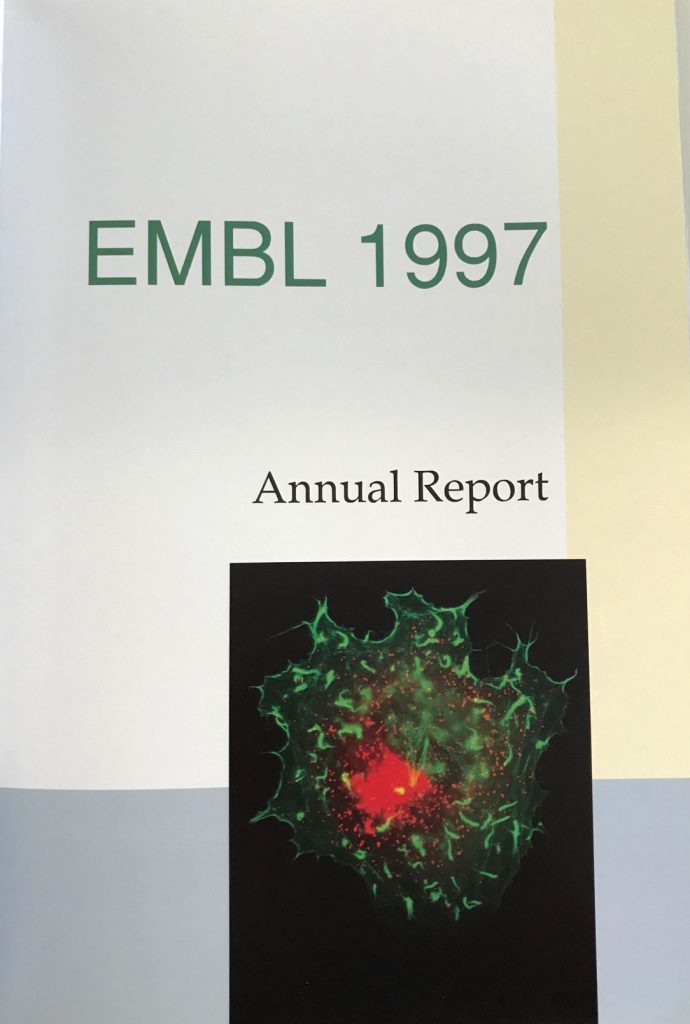
In all events, it seems that the first use of the EMBL logo, though not quite as we know it, was the cover of the 1982 Annual Report. There were 217 dots.
But, what had EMBL been using in lieu of a logo before 1982?
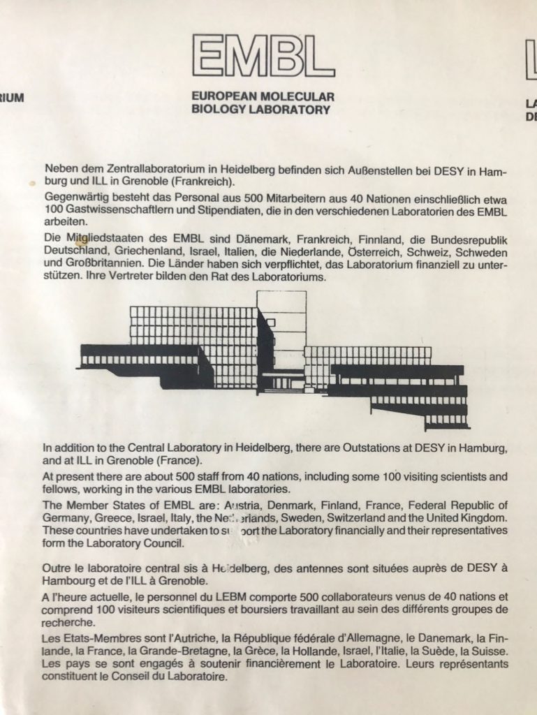
The Heidelberg Laboratory was inaugurated on 5 May 1978, and around that time, a sketch of it started being used as a symbol for EMBL. The Laboratory’s shape, still recognizable today, appeared on leaflets and letter headings.
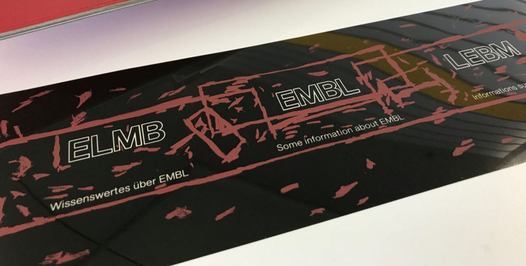
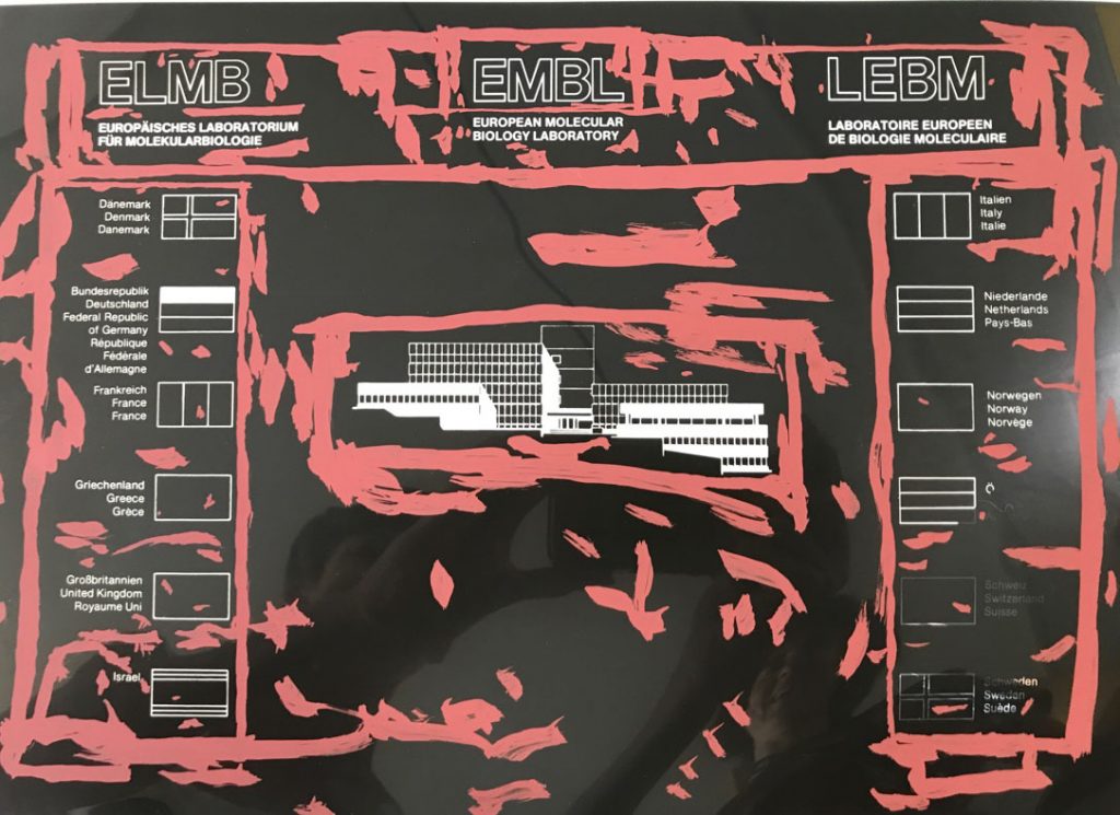
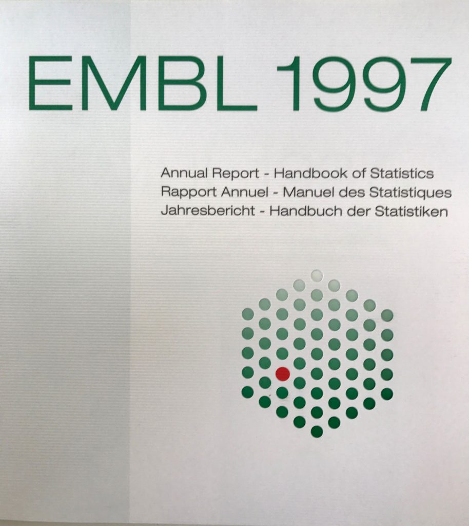
At this time, EMBL was even still using 3 languages, so the Laboratory’s acronym looks a bit strange too…Version, Year 1997, with fewer dots:
Colours and orientation:
The main colours have always been tones of green and rather more than less white space. Different shades of green have been used through the years. A number of times, the logo appears on its side rather than “standing” on a corner!
Some examples:
Font:
As font it was mainly used a sans serif typeface or a typewriter typeface. We seem to have had a preference for robust typefaces from early on.
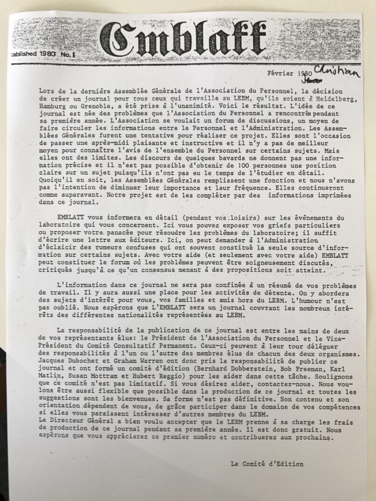
This use of a typewriter font appears to have been a one-off for the newsletter of the Staff Association in 1980. The title is a play on words: ‘das Blatt’ means ‘the leaf” or the sheet in German, and can be used to refer to a newsletter. At this time, these newsletters were simply typed on a typewriter and copied.